(Description)
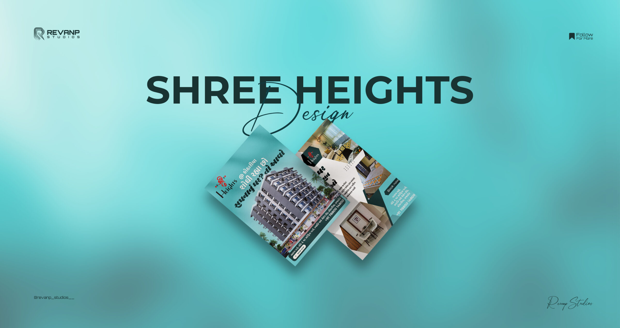
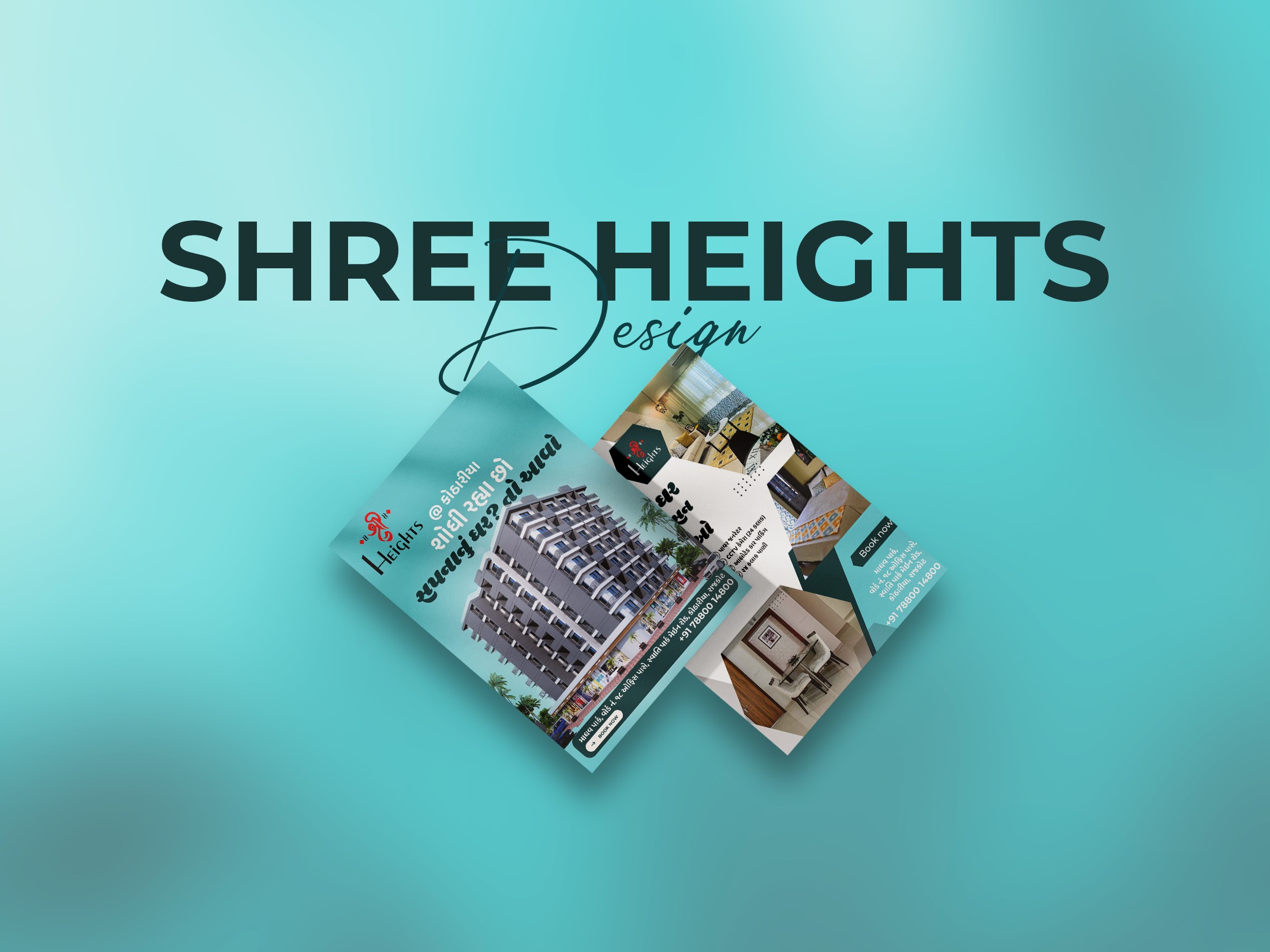
Shree Heights approached Revanp Studios with the need to elevate their presence in a highly competitive real-estate market. As a modern residential project offering well-designed flats, they had the infrastructure, the amenities, and the value — but lacked the visual communication needed to stand out. Their existing marketing materials felt flat, inconsistent, and failed to convey the sophistication of the property.
They needed more than just promotional designs; they needed a visual identity that could capture the lifestyle, comfort, and aspiration behind Shree Heights. Our goal was to craft a flyer system that not only showcased the flats, but also communicated trust, modern living, and premium quality at first glance.

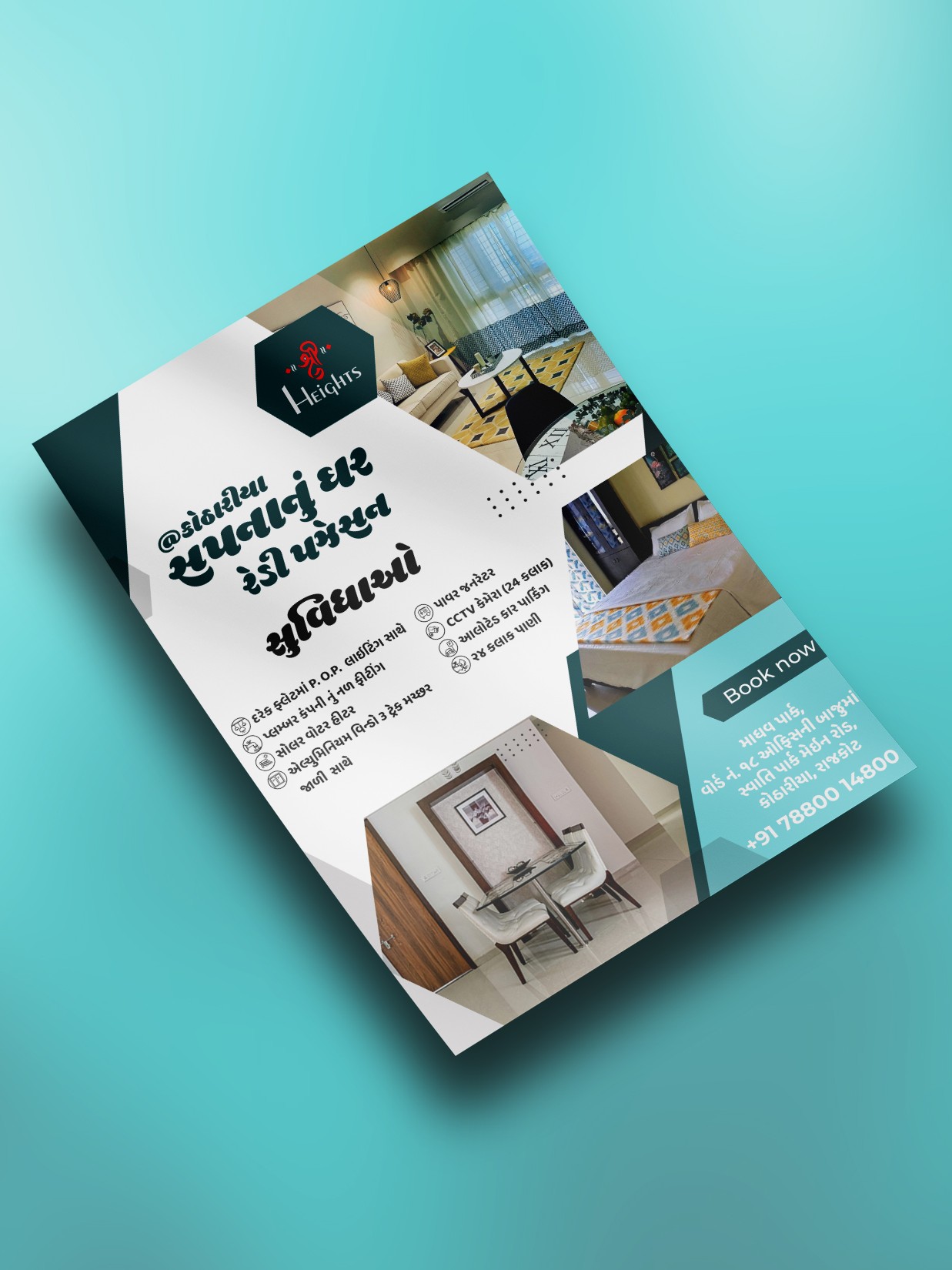
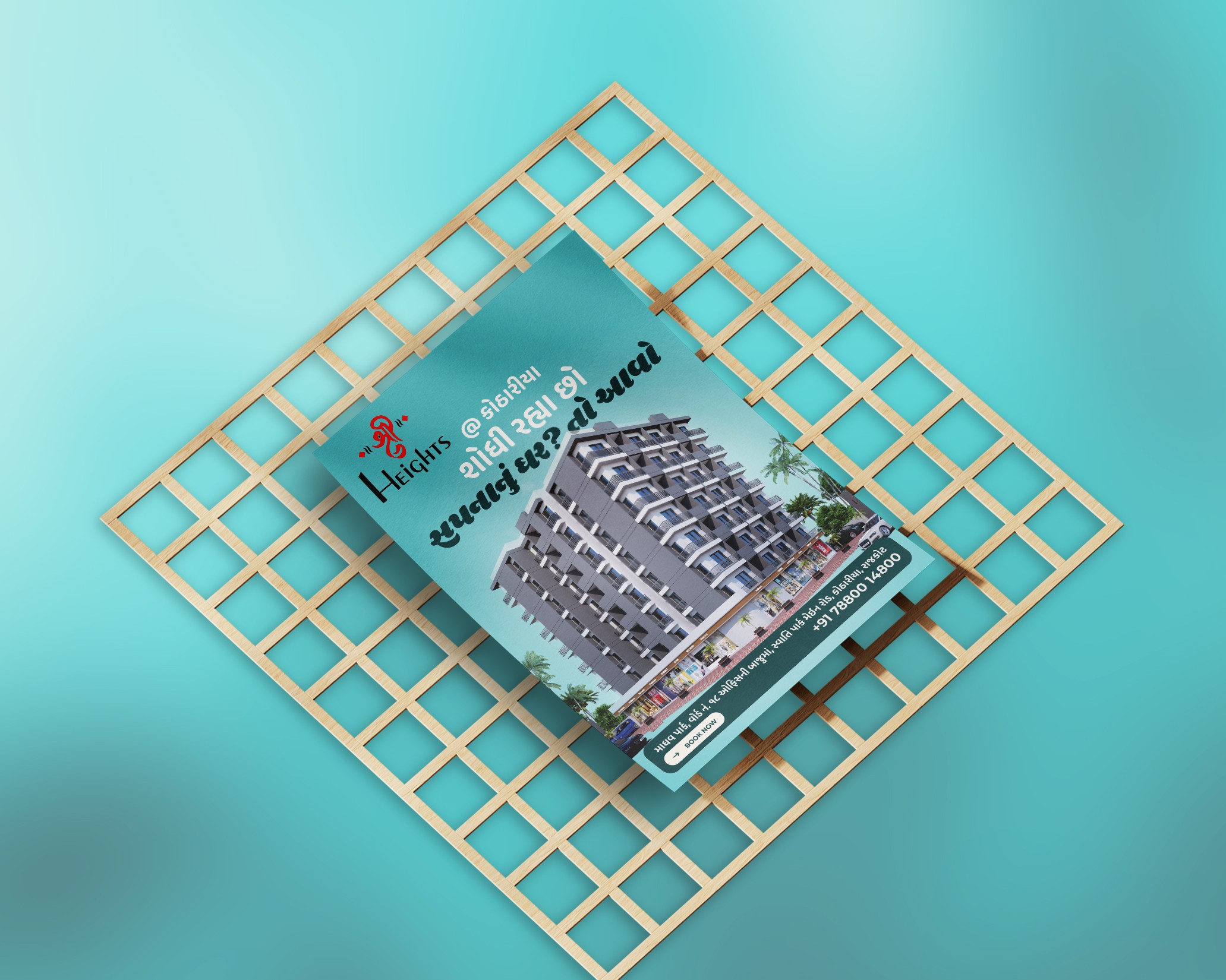
For Shree Heights, our focus was to translate the project’s modern architecture and lifestyle promise into a clean, compelling, and easy-to-grasp visual system. We designed a series of flyers that balanced elegant layouts with clear information hierarchy, ensuring that every detail — from floor plans to amenities — felt accessible and visually appealing.
We used modern typography, a refined color palette, and high-quality imagery to capture the premium living experience the project offers. Each flyer was structured to guide potential buyers smoothly through the features, benefits, and highlights of the property.
The result was a cohesive marketing toolkit that elevated the project’s presentation and strengthened its appeal in a competitive housing market.
The impact of EduKids’ brand transformation was felt immediately. Parents responded to the new identity with increased trust, and inquiries for admissions rose as the brand began presenting itself with more clarity and professionalism. Their social presence became more engaging thanks to a consistent visual language, and every touchpoint — from brochures to banners — now communicated the warmth and credibility parents look for in a preschool.
Internally, the EduKids team felt re-energized. With a polished, cohesive brand, they gained a renewed sense of confidence in how they presented their school. Communication materials became sharper, more organized, and more aligned with their true values. The brand finally looked as inspiring as the learning environment they offer.