EduKids

(Description)

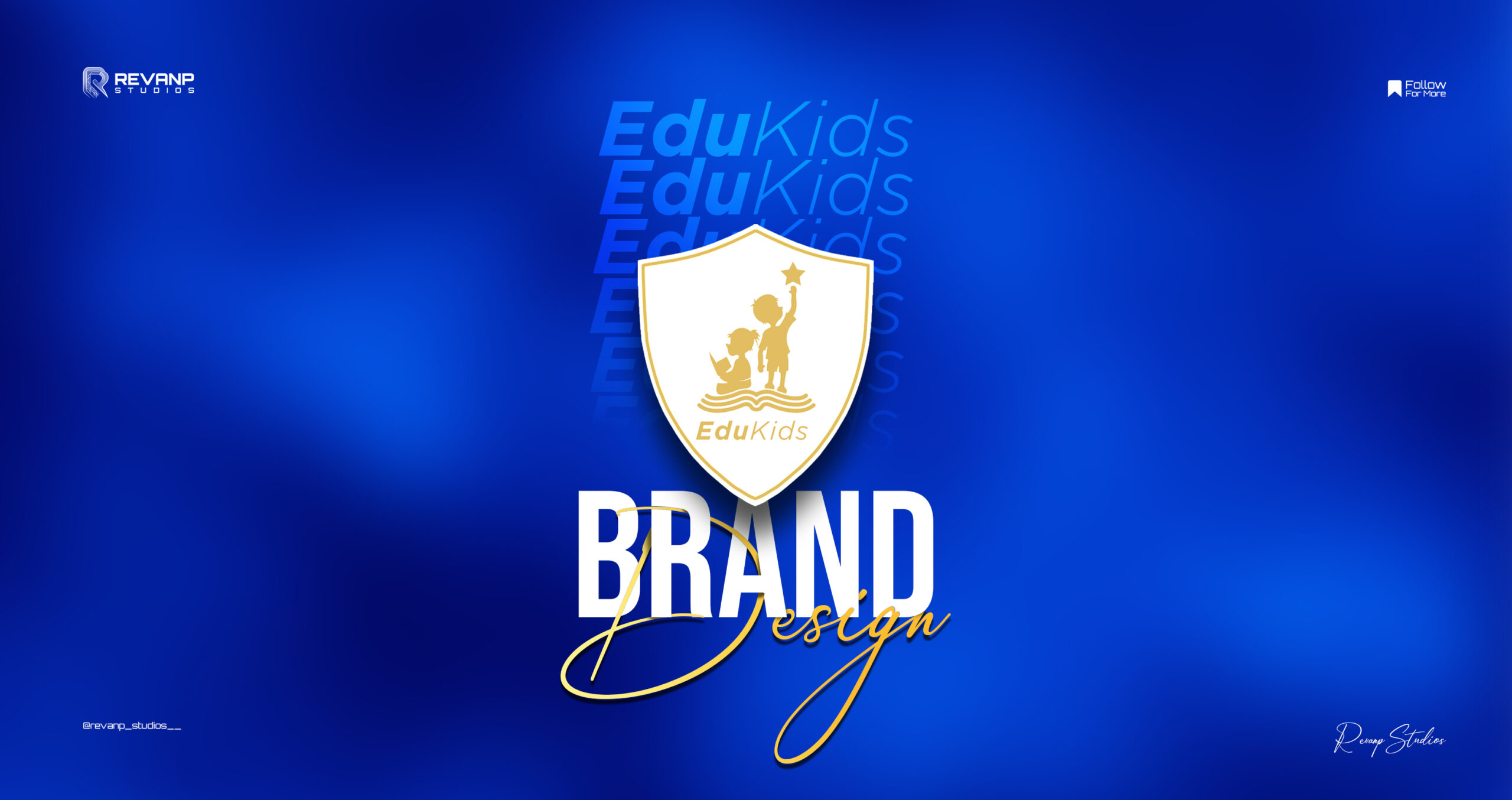
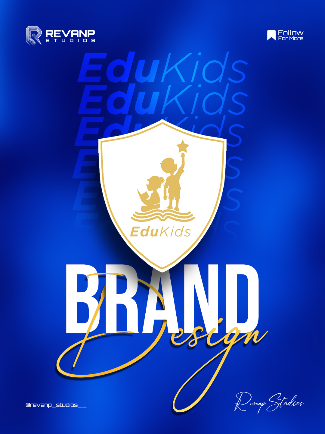
EduKids Preschool approached Revanp Studios with a vision to evolve beyond their scattered and inconsistent visual identity and build a brand that truly reflected their values of creativity, learning, and trust. As a growing preschool with big ambitions, they had the heart, the culture, and the impact — but lacked a unified brand system to express it. Their logo, colors, and communication style didn’t capture the warmth or professionalism they stood for. EduKids needed more than a design refresh; they needed a complete brand foundation — one that felt modern, child-friendly, and inspiring, while also being scalable across all touchpoints from stationery to signage to digital presence.

Challenges & Objectives

/ Project Overview

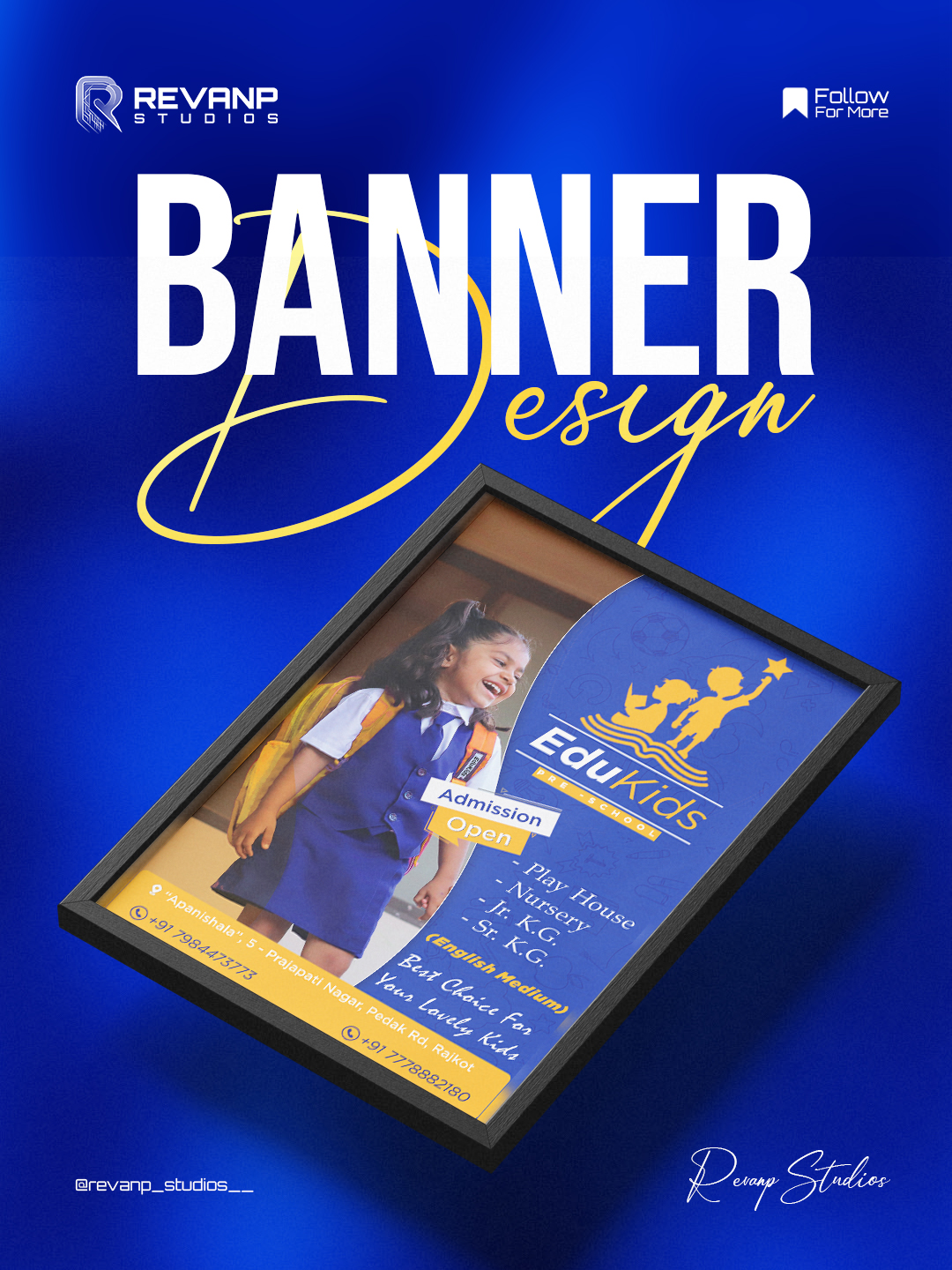
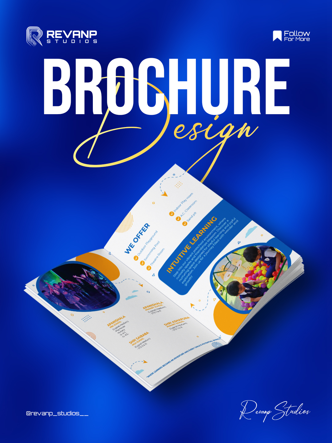
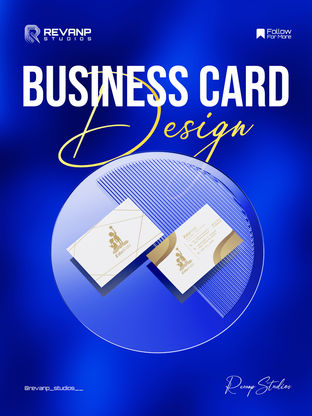
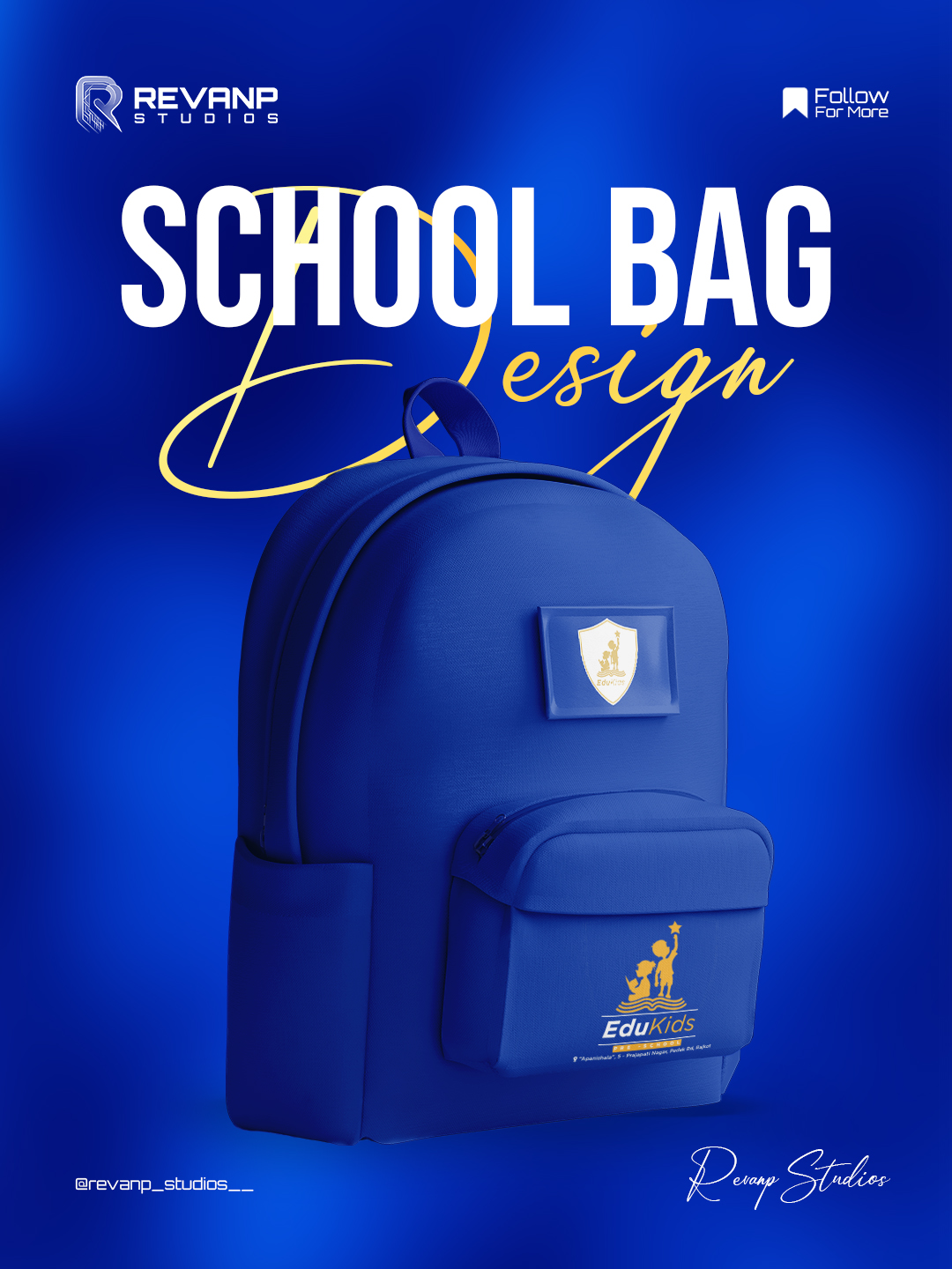
For EduKids, we transformed their refreshed identity into a clean, joyful, and scalable design system. Every element — from brochures to banners — was built to feel modern, child-friendly, and consistent across all touchpoints.

/ Challenges

We balanced clear, confident typography with softer supportive text, introduced custom icons inspired by early-learning shapes, and used a vibrant structured color palette to unify the brand. Subtle design details and playful visual accents added warmth without losing professionalism.

/ Objectives

The result was a cohesive, memorable identity that feels alive, trustworthy, and ready to grow with EduKids.


/ Final Outcome

The impact of EduKids’ brand transformation was felt immediately. Parents responded to the new identity with increased trust, and inquiries for admissions rose as the brand began presenting itself with more clarity and professionalism. Their social presence became more engaging thanks to a consistent visual language, and every touchpoint — from brochures to banners — now communicated the warmth and credibility parents look for in a preschool.


Internally, the EduKids team felt re-energized. With a polished, cohesive brand, they gained a renewed sense of confidence in how they presented their school. Communication materials became sharper, more organized, and more aligned with their true values. The brand finally looked as inspiring as the learning environment they offer.